
Planned Parenthood Direct
My Role UX Audit & UX/UI Design
Tools Figma
Timeline 3 Months
Planned Parenthood Direct is an app which helps Americans to access virtual healthcare and manage prescriptions for Birth Control, Emergency Contraception and UTI treatment.
The problem
Users of the platform complained that it was difficult to see the status of their prescription refill. There were three types of user blocks outlined, which were all related by how it was difficult to get to the page that hosted this information.
3 user types
1) Auto-refill: If the user had signed up for automatic refill shipments to their home, they couldn't figure out when their refill had shipped.
2) Manual-refill: If they had signed up for manual shipments, they could not find where they needed to confirm those shipments.
3) Send to pharmacy: And if they had signed up to have refills go to their pharmacy, it was difficult to find the information on their pharmacy.
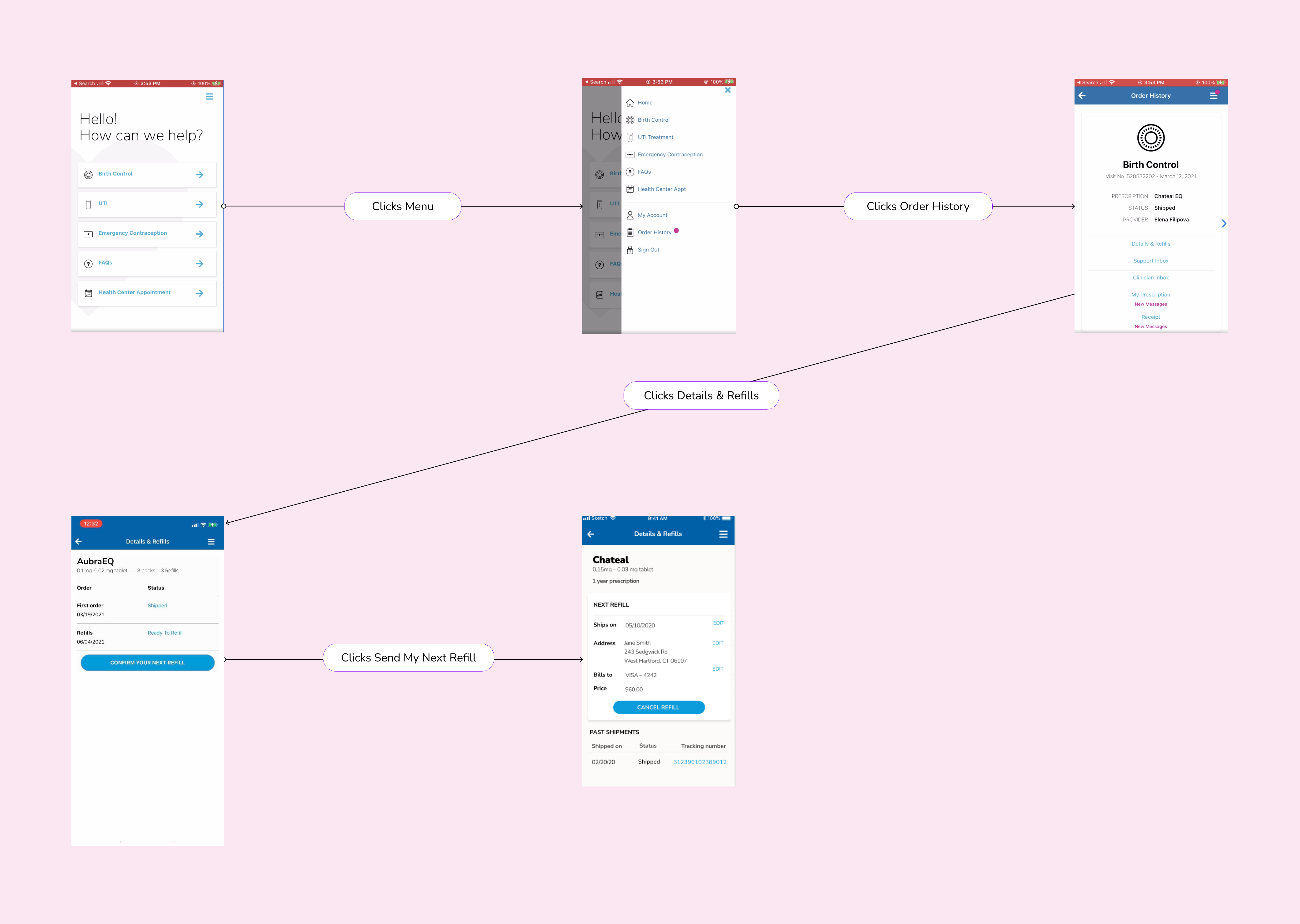
Original flow (click image for closer view)
This wireflow shows the existing route that a user would take to see the details of their refill. Having this important page hidden in the menu as well as naming the page "Order History" made it difficult for users to find the information that they needed.
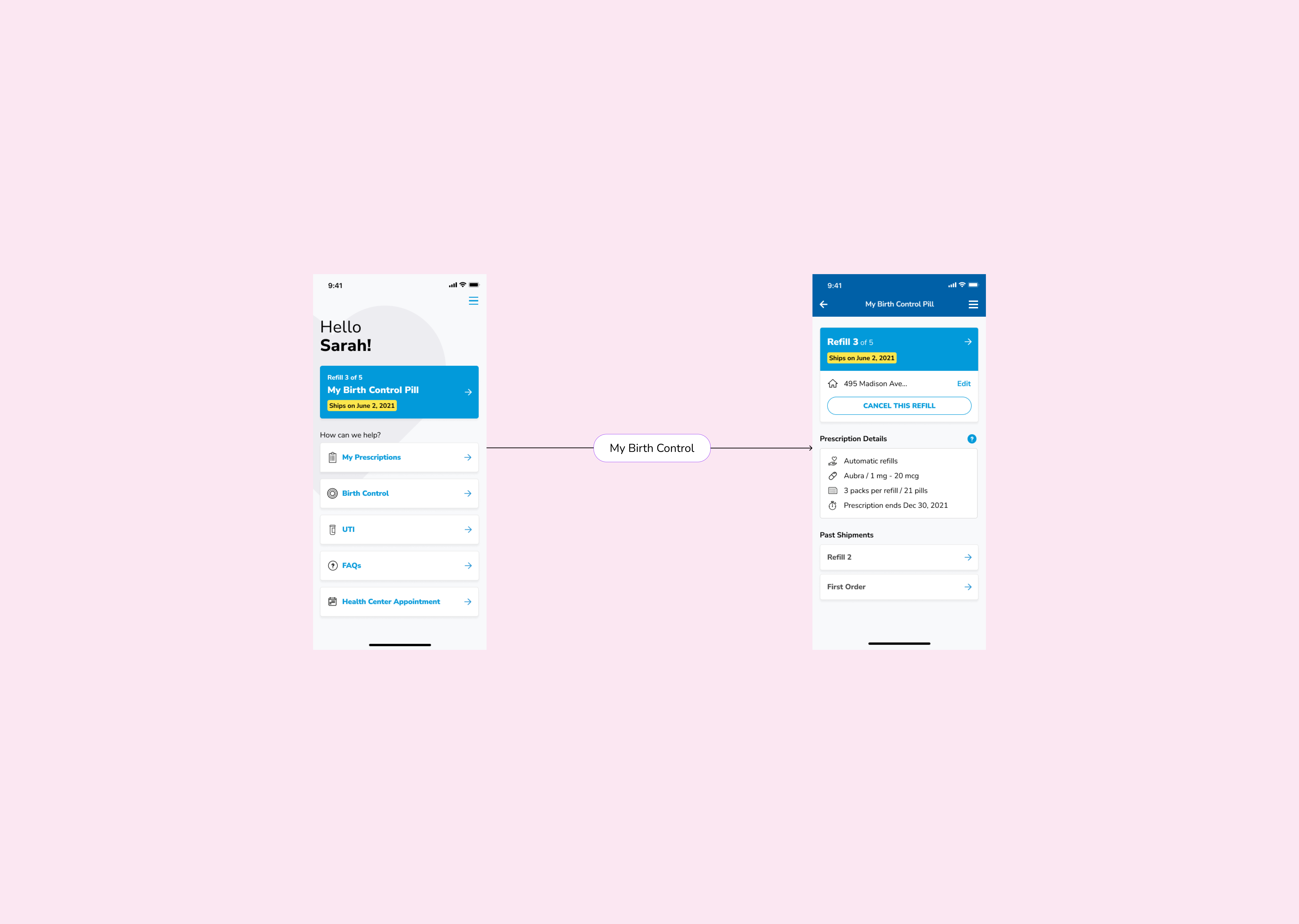
Improved flow
People primarily use the platform to manage their birth control prescription. For this reason, I suggested to have a card which indicates the status of the prescription right on the homepage. This meant that instead of having to go through multiple screens to get to prescription details one can do it directly from the first screen.
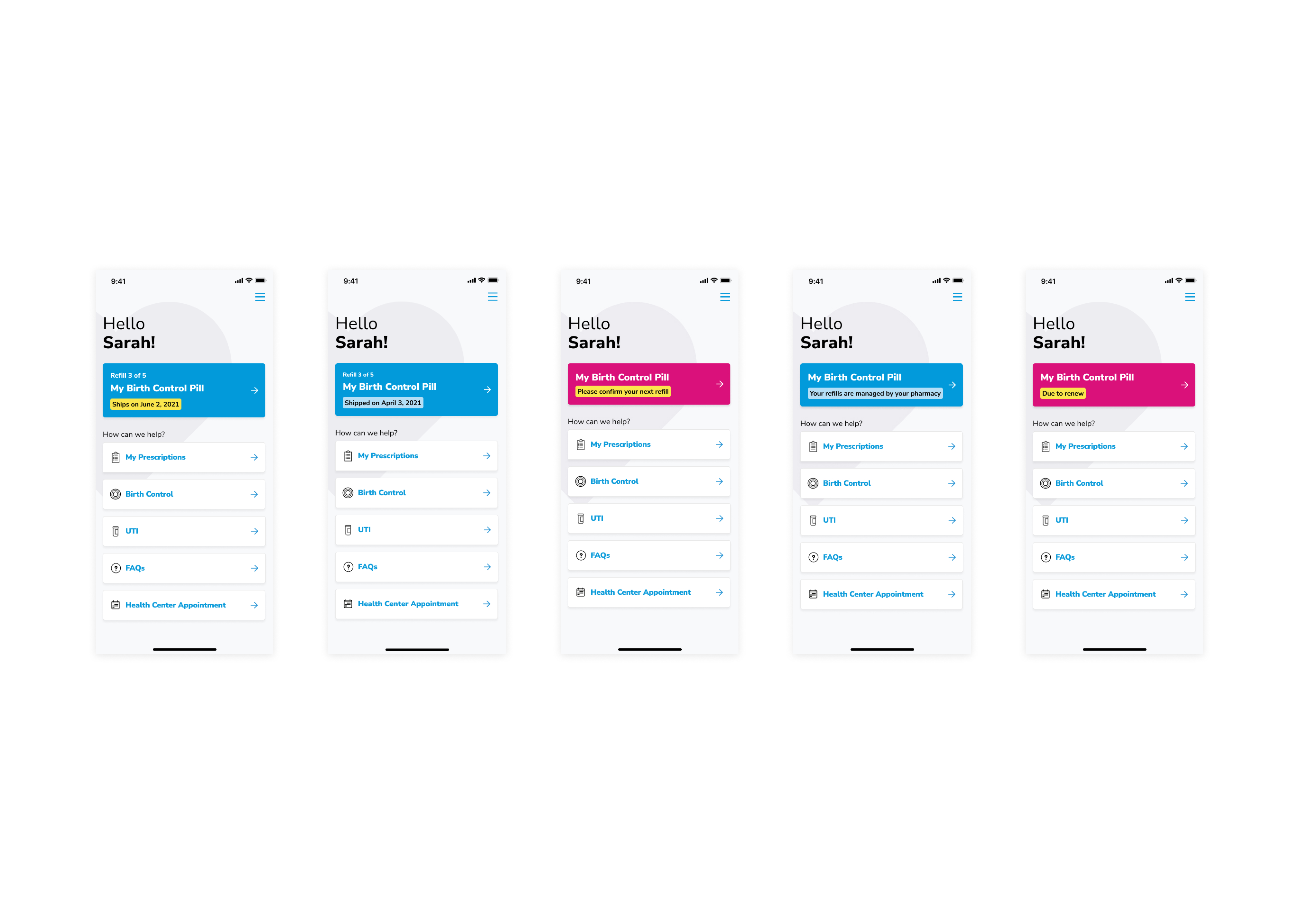
Additional Improvements
Users were having difficulty finding out how many refills were left before their prescription required a renewal. The design of this new notification includes both a status label as well as the refill number which puts these two most important pieces of information at the forefront.